Vanishing Points: Phillips’ Postwar “New Look” Service Stations
Vanishing Points: Phillips’ Postwar “New Look” Service Stations
At Phillips Petroleum, one mid-October day in 1958 would be remembered as the day “Boots saved the shield.” It was a typical corporate moment.
The proposal to change Phillips’ logo had come from the design and marketing firm of Lippencott & Margulies’ (L&M ) young account executive, G. William Anderson, Jr. Anderson hoped to sell Phillips a $100,000 design service that L&M called “corporate identity.” At the final presentation, everything seemed to be going well. Phillips Vice President of Sales, Ted Lyons, said he loved L&M’s new look for Phillips’ stations. However, company chairman Boots Adams had not yet seen the new trademark. When he did, he shouted his objection: “we’ll keep our present shield.”1

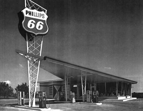
A swept wing station from the Bright New Designs brochure, early 1960s. See related video.
This seemingly small conflict over a corporate logo was more than a debate about marketing. It symbolized a much wider discussion about the role of design in postwar American life. The service station became a center of that debate. Thanks to Adams’ intervention, the shield would survive, but Phillips would adopt a new style for its stations. It is at that vanishing point – as old designs are replaced by new – that we can see Americans reinventing their representations of themselves.
The following examination explores the design of Phillips Petroleum’s postwar service stations as sites where American middle-class architects, marketing professionals, and consumers expressed their design ideas and social values. Phillips’ postwar stations were examples of the “New Look,” an abstract art influenced design aesthetic that became the zeitgeist of the 1950s. Other examples of the New Look included Christian Dior’s fashions, Jackson Pollock’s action paintings, and Herman Miller furniture. Phillips’ stations expressed the New Look through large aluminum-framed display windows, staggered rooflines, brick or stone veneer exteriors, and daring canopies that rose to a vanishing point….
The Origins of Phillips New Look
Phillips embarked upon an expansion program after World War II that sought economics-of-scale by marketing nation-wide. As with today’s convenience stores, they built stations to meet the imagined needs of motorists. Like most commercial architecture, the stations were examples of what designer Brook Stevens called, “planned obsolescence,” a form of continuous product development.2 They were periodically redesigned to stimulate consumer demand.
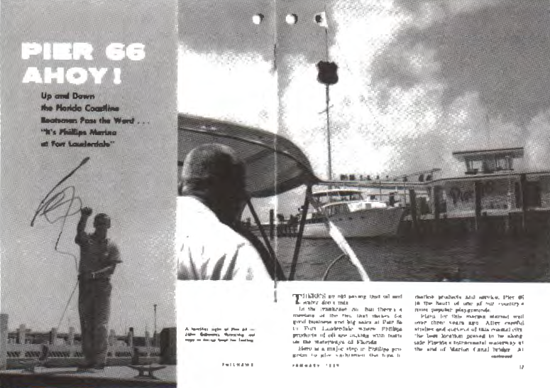
By the late 1950s, Phillips’ executives were expressing concern about the company’s dated look. In an effort to develop a new image that would improve brand recognition and symbolize the company’s shift from a family-run business to a modern corporation, Phillips tested new gas station ideas in the company’s headquarters town of Bartlesville, Oklahoma, and in Florida.3 Phillips had already grafted a flamboyant, V-shaped canopy onto a “New Look” service station in 1956 at a Ft. Lauderdale marina complex called Pier 66. For Phillips, this experimental station was an important step. A few years later, versions of the distinctive canopy would soar nationwide.
Phillips shift to the New Look occurred in three stages. First, during the early-1950s, it introduced rock-faced, large slanted-window stations known as Rock Frames.4
Second, in 1958 it sought the outside expertise of L&M to change its color schemes and general appearance, resulting in the painting of red, diamond-like symbols, on the stations.
Third, during the early 1960s the company introduced new stations, called Harlequins, which featured a modified Rock Frame floor plan and a pointed batwing canopy. When the cover of Phillips’ 1959 annual report announced “The New Look,” which encompassed the new station design, a new trademark, and revamped colors, these elements taken together amounted to a design revolution.

Pier 66 Marina, the first use of Phillips’ swept-wing design in 1956, at least four years before Phillips began building such “Harlequin” stations nationwide. It was pictured in the January 1959 Philnews. – Unless noted otherwise, all photos from author’s collection, used with permission of Phillips Corporate Archives.
Phillips search for an appropriate image for its service stations was dictated by what a 1957 Pure Oil ad called “America’s second automobile revolution.” Pure Oil said America’s proposed $100 billion network of freeways would create “strip cities” and shopping centers. The ad promised a “new breed of service station” suited to the new environment and assured consumers that “time and motion analysts” were working to meet their future needs.5
There’s more! To read the rest of this article, members are invited to log in. Not a member? We invite you to join. This article originally appeared in the SCA Journal, Spring 2005, Vol. 23, No. 1. The SCA Journal is a semi-annual publication and a member benefit of the Society for Commercial Archeology.
More Articles Join the SCA


1 Comment