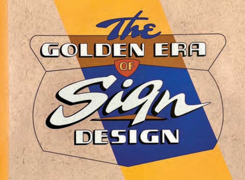
The Golden Era of Sign Design: The Rediscovered Sketches of Beverly Sign Co.
By Kelsey Dalton McClellan and Andrew McClellan
Chicago: Heart & Bone Signs and Heavy Pages Press, 2024, 2024
Hardcover, 216 pages, 85
Reviewed by William Swislow
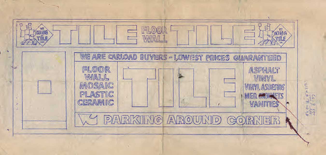
 It’s not often that you get to see technical diagrams of ghosts, but this book collects around 140 sketches that are exactly that — design drawings, complete with notes, color specs, and other instructions, from Chicago’s prolific Beverly Sign Co. These drawings were used to sell and execute wall signs, billboards and truck and van signs, almost all of which became ghost signs long ago. Those signs themselves have disappeared, making this a volume devoted to ghosts of ghosts.
Innovative and nationally influential, Beverly was founded in 1935 and survived into the 1980s. How it came to be featured in this book is an intriguing story. Authors Kelsey Dalton McClellan and Andrew McClellan operate Chicago-based Heart & Bone Signs, which specializes in hand-painted signs, including traditional gold-leaf lettering. When 90-year-old ghost signs for Shell Oil and
Wards Bread were uncovered on a building about to be demolished on the city’s North Side in 2022, they helped lead the successful
preservation effort.
The Shell sign is in storage. The Wards sign, which wound up at the American Sign Museum in Cincinnati, included a signature for Briggs Outdoor Adv. Co. Bob Behounek, another sign painter who worked to preserve these ghost signs, recognized Jack Briggs not only as the painter of this 1930s-era bread sign but also as the later owner of Beverly Sign Co. Behounek, active in the sign painter community, happened to have in his possession a collection of drawings from Beverly. The McClellans and Behounek decided to work together to publish a selection of those drawings.

The pictures themselves, dating from 1957 into the 1980s, were preserved by just the kind of fluke that is often required to save things treated in their own time as debris rather than art. Behounek had received the drawings from a one-time journeyman artist at Beverly, Dan Colyer. As Colyer explains in the book: “When I was working at Beverly, the foreman asked me to clean out the sketches and told me to throw them out. I asked if I could keep them and he said he didn’t care what happened to them as long as I got them out of the shop. So, I kept them.”
Because many of the drawings are signed, we know the identity of the artists — Ken Millar, Clyde Sellers, and Mike Borda. As the McClellans write in the book’s introduction, “These three designers led a team that sparked a movement of modernist sign design that fundamentally changed how signs looked at the time.” The fact that many Beverly artists had prior experience creating theater show cards, and thus a deep understanding of typography, helped energize the work.
“The development of the design theory and practice of ‘panelization;’ that is, dividing the design of a sign into various geometric-shaped panels rather than simply lettering on a single background, began with the designers at Beverly Sign Co.,” the McClellans write.

Beverly’s artistic significance was underscored by Chicago sign painter Pat Finley in fNews Magazine, published by students at the School of the Art Institute of Chicago: “Beverly garnered national attention for their development of the avant-garde ‘Chicago Look,’ a
combination of pastel colors and panelization,” as Finley explains. ‘You take a color-filled geometric shape and insert type into it, and then that breaks down the design into a few different signs, depending on size. That was unheard of before Beverly — those people were pioneers, and with everything they did, the world followed.’ It attracted flocks of aspiring sign artists.”
Seeing these important drawings now is exciting but also a little sad. If you’re like me, you’ll look up addresses on Google Maps to see if any signs still exist. I found one that might possibly have survived for a fondue restaurant that closed in 2023. However, only the handle of the fondue pot is now visible on the building’s wall. The rest is hidden under a plastic banner, so it’s unclear if it’s the sign depicted in the Beverly drawing. Otherwise, there are apparently no survivors.
The lifespan of roadside imagery is typically brief, and the businesses themselves may not long outlive their signs. That certainly applies to the companies in this volume, which turns out to be a catalog of mostly defunct enterprises — banks, restaurants, drug stores, auto dealers, hardware stores — nearly all ghosts, like Beverly itself.
But the book is beautiful. At $85, it’s an investment, but the price is understandable. The production economics of self-published books push costs higher from the start. More importantly, the price tag underwrites lavish production values, including a large format for the volume and several fold-out pages, in addition to content that you won’t find published anywhere else. How often can you see how those ghost signs were created? The drawings and notes are marvelous, so it’s worth ponying up if you care about wall signs or hand-painted signage.
Copies are available at https://heavypagespress.com
William Swislow operates interestingideas.com and sits on the boards of the SCA and Chicago’s Intuit Art Museum. He wrote and published Lakefront Anonymous: Chicago’s Unknown Art Gallery, which is about rock carvings along Chicago’s waterfront.
This book review originally appeared in the SCA Journal, Spring 2025, Vol. 43, No. 1. The SCA Journal is a semi-annual publication and a member benefit of the Society for Commercial Archeology.
More Book Reviews