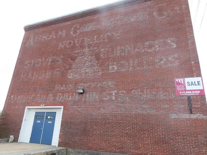
Abram Cox Stove Co. historic sign erased from building during renovations
Photo by Dan Sokil | The Reporter
From North Penn Now: During public comment at its meeting last week, Lansdale, PA, Borough Council fielded a comment about another trace of the town’s history that has disappeared.
“The Cannon Lofts: I guess they erased the business that was there, years ago,” said resident Rose Chapman. “We’ve obliterated something from the past.”
In 2022 council approved plans for the ‘Cannon Lofts,’ a plan first presented in 2021 to convert the three-story brick building at 501 N. Cannon Avenue into 24 apartment units. The building was built to house the Abram Cox Stove Works, one of the largest employers in the borough in the late 1800s into the early 20th century, which manufactured “novelty stoves,” known for producing high levels of heat for their size. Leases for units within opened in late 2023, and traces of an advertisement for ‘Abram Cox Stove Co’ could still be seen on the exterior wall until local residents spotted the paint had been erased as the bricks were resurfaced in early May.
North Port Commissioners Vote Against Demolishing Historic Structures at Warm Minerals Springs
Warm Mineral Springs Park is located at 12200 San Servando Ave. in North Port. IMAGE: JUSTIN FENNELL
From Sarasota Magazine: At yesterday’s regular meeting, City of North Port commissioners voted unanimously to not demolish three historic buildings at Warm Mineral Springs. The vote followed a presentation by the Sarasota Alliance for Historic Preservation (SAHP), which presented options for drawing on state and federal preservation grants, city funds and tax credits to help restore the historic structures.
Those buildings include a park spa building, a sales building and a cyclorama, which contains an exhibit depicting Ponce de Leon’s alleged discovery of Warm Mineral Springs, which he assumed was the Fountain of Youth. The spa building and the cyclorama were designed by Jack West, a leader of the Sarasota School of Architecture.
This Gresham diner’s iconic mascots have been removed. What’s next for the beloved signs?
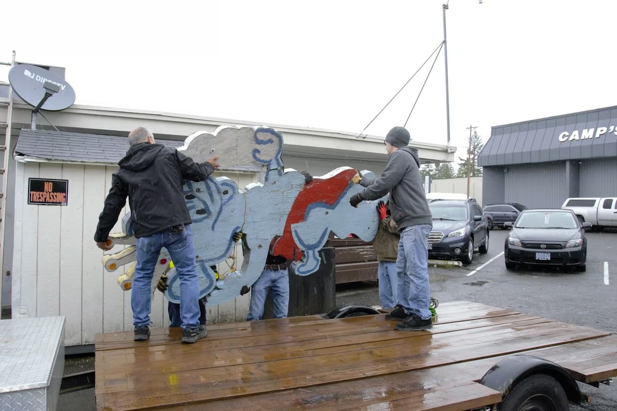
Volunteers from the Gresham Historical Society remove the 8-foot-tall sign from atop Polar King. (Gresham Historical Society)
From Here Is Oregon: Driving down U.S. 26 from Portland to Gresham, one of the first things people would notice were the two 8-foot-tall plywood bears atop a small 1950s-building, next to the neon lights that spelled out the diner’s name: Polar King.
But after more than 70 years beckoning Gresham customers, the weather-worn bears have been removed from Polar King and their future is still to be determined.
Established in 1952, the diner has become a local favorite known for its nostalgic charm, signature milkshakes and friendly servers. Jai-Young Hong has owned the restaurant since 2016.
Fire devastates iconic Penn Yan Diner, leaving community and owners heartbroken
A May 21 fire in Penn Yan caused heavy damage to the Penn Yan Diner. The owners are trying to figure out next steps for the nearly century old restaurant mainstay in that Yates County community. Penn Yan Diner
From WXXI: A recent fire has left a beloved Finger Lakes area restaurant severely damaged, leaving both the community and the owners devastated and unsure about its future.
At around midnight on Wednesday, May 21, the Penn Yan Diner in downtown Penn Yan, a Finger Lakes community in Yates County, caught on fire for reasons that are still unknown.
“I was able to see, unfortunately, the glow of the building from pretty far away,” said Alicia Avellaneda, co-owner of the diner, which is an award-winning mainstay of the area.
The revival of California’s vintage motels – thanks to Barbie, Instagram and a cult new coffee table book
Palm Springs Trixie Motel is a seven-room vintage-inspired oasis (Trixie Motel )
From the Independent: When Alex Madonna first opened the Madonna Inn in 1958, it was with a relatively simple ambition: to create a place where people felt happy. Armed with leftover materials from his construction company and a wife with a certain flair for outrageous interiors, it took 20 years to complete the resort – during which time it had morphed into something far beyond even theMadonna’s wildest dreams.
Today, the Madonna Inn is celebrated as America’s most iconic fantasy motel. Situated in San Luis Obispo, halfway between Los Angeles and San Francisco, a towering hot pink sign at the roadside welcomes me back to this pleasure palace. I’ve been visiting the Madonna Inn for over a decade now, during which time the high-camp décor has gradually slipped back into fashion, reshuffling the clientele. Old-timers now share the whimsical space with a younger cohort of hipsters who discovered the Madonna Inn through social media and fashion magazines, including the front cover of Vogue Portugal.
History Rewritten: A Portage Park illustrator preserves Chicago’s past one letter at a time.
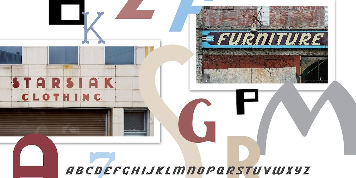
Storefronts from Englewood (above) to West Town (right) have inspired Shanabruch’s typefaces. Photography: (buildings) Michael Zajakowski
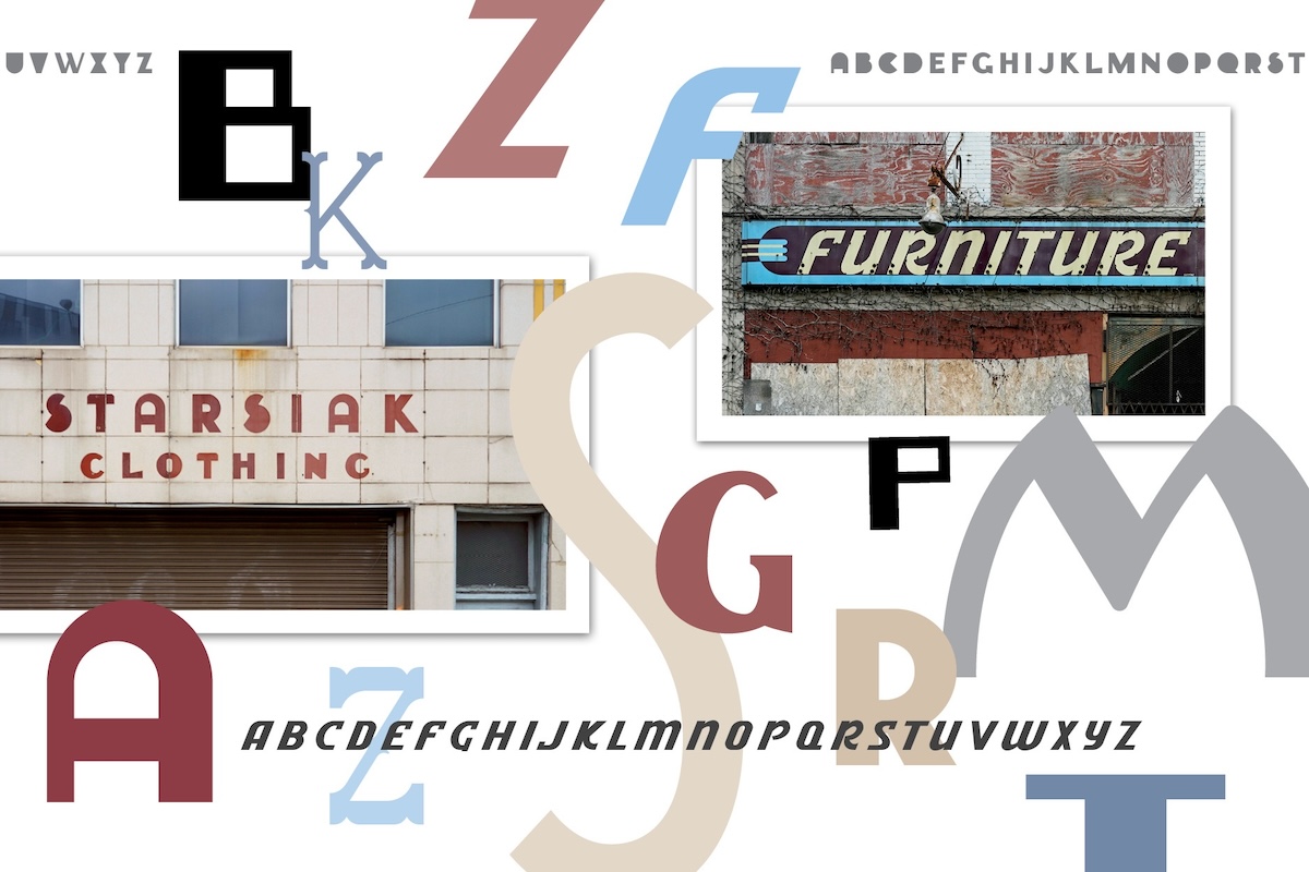
From Chicago Magazine: The storefront that first caught Shanabruch’s eye was once lost to history. Starsiak Clothing, a humble suit shop that opened in 1916 at the Polish Triangle on Milwaukee Avenue, at Division Street and Ashland Avenue, lasted for 65 years, run by two generations of Starsiaks who made clothing for the Polish population once prevalent in the neighborhood. In 2005, the storefront was rented out to Espace, an athletic shoe store, and when it went out of business in 2018, the removal of its metallic sign revealed the original Starsiak logo underneath.
Shanabruch, an illustrator with no formal typographic training, was one of many people captivated by the rediscovered sign, with its heavy rounded type. So he decided to re-create it. Armed with a handful of new digital brushes and textures he’d bought on Adobe Illustrator, he started playing around with lettering, teasing the idea of building a full-fledged typeface based on the sign. The words “Starsiak Clothing” contain just a dozen letters of the alphabet (including the all-important S, probably the logo’s most memorable letter, which looks like a circle sliced at an upward 45-degree angle), so designing an entire font required Shanabruch to improvise the remaining characters. But he enjoyed the challenge, and his typeface, simply and fittingly named Starsiak, came together over the next few months, comprising 91 different glyphs, or unique characters, including 12 alternate letters (mostly letters like A, B, D, and others with the white space filled in), and 38 punctuation marks.


